All Activity
- Past hour
-

May 2024 Pacific Northwest Weather
Port Angeles Foothiller replied to snow_wizard's topic in West of the Rockies
If you figure out how to get rid of them, please share the knowledge! They are annoying buggers -
And about the same size as the Snoqualmie/North Bend area which is tiny.
-
getting some pop up graupel/hail showers
-
May 2024 Pacific Northwest Weather
Rubus Leucodermis replied to snow_wizard's topic in West of the Rockies
It's only the largest city on the Olympic Peninsula. -
Still raining!
-
3 of the 4 years in that dataset are La Nina, one El Nino. would be interested to see if it continues regardless of ENSO state
-
May 2024 Pacific Northwest Weather
Chewbacca Defense replied to snow_wizard's topic in West of the Rockies
Got all the soil off the driveway, ended up giving a couple of yds to a friend. I got everything leveled, raked out, seeded, raked out again and rolled by about 4pm Saturday. Got the tools I rented cleaned up, loaded into the car and returned, and when I walked out of the rental shop, it was raining. Not much, just enough to wet the pavement, but the gods smiled on me for this project. The sunny warm days coming up later this week will be an added bonus. Got .46" of rain Sunday, and did not have any standing water in the back yard (.3" is the magic number) and another .1" this morning. One crappy thing that happened though is I went out to see how things looked after the rain, and I had mole tunnels running all over the place. So now I guess I need to figure out how to convince them that they need to find someplace else to graze. -
May 2024 Pacific Northwest Weather
Port Angeles Foothiller replied to snow_wizard's topic in West of the Rockies
Sorry to go off the rails here. This will be the last graph for a while. But I find it interesting that the north peninsula has also been warmer than average in the same areas as the shifted shadow. Less rain/cloud cover leading to more sunny days I suppose. Sure seems like that typical shadow is moving. Am I to assume this also "leans warm"?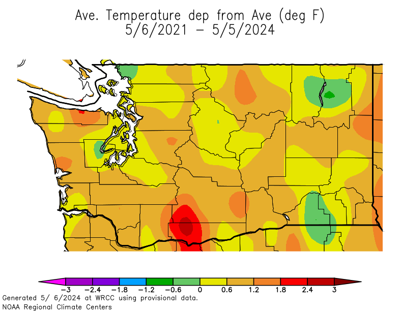
-
Could just be varying pattern regimes.
-
May 2024 Pacific Northwest Weather
Port Angeles Foothiller replied to snow_wizard's topic in West of the Rockies
Sure hope not. -
It definitely leans dry. Any missing data from any station will exaggerate that effect.
-
May 2024 Pacific Northwest Weather
Port Angeles Foothiller replied to snow_wizard's topic in West of the Rockies
This shift would almost require a SSW flow or a straight up S flow. -
that's approaching a trend, Climatological change may be around the corner if that keeps up
-
Must be related to more dominant SW flow than usual... only way to explain it.
-
May 2024 Pacific Northwest Weather
Port Angeles Foothiller replied to snow_wizard's topic in West of the Rockies
It is still a blend of hundreds of stations. So, although it may lean dry, it is not an overwhelming lean. You can still pull the trends from the charts. -
oh that's the Tim algorithm, Very Secret in source
-
See above. That is just how it works. I am not trying to be difficult.
-
May 2024 Pacific Northwest Weather
Port Angeles Foothiller replied to snow_wizard's topic in West of the Rockies
Going back 3 years, you can see the issues really started after our cold/rainy spring in 2022. Since then the faucet has been a drip for the northern peninsula. Seems like the shadow has shifted West compared to the last 30 year averages, which is an interesting phenomenon.
-
Those WRCC maps blend all stations together without regard to completeness of data. Or data issues like Boeing Field which has major issues currently and is massively under-reporting rainfall amounts. Lots of the smaller stations frequently have missing days. With temp maps... missing data could go either way (warm or cold) but when precip data is missing its always in one direction and that is drier than reality.
-
May 2024 Pacific Northwest Weather
Port Angeles Foothiller replied to snow_wizard's topic in West of the Rockies
It seems to only be bad when it proves him wrong. I honestly have no other answer. I'm not sure why I am letting it frustrate me so much. -
May 2024 Pacific Northwest Weather
Port Angeles Foothiller replied to snow_wizard's topic in West of the Rockies
Can you point me to the site you pull your data from? -
so the map is only bad when it shows drier than normal?
-
May 2024 Pacific Northwest Weather
Port Angeles Foothiller replied to snow_wizard's topic in West of the Rockies
This is what I don't understand. This chart is almost an exact reflection of the hard rain gauge data in my area. How is my area the only one correct on this map? When you look at the last 2 years, the issue gets compounded. Real life people are feeling these numbers in my area. I'm not a "drought alarmist" these are just facts. I made the reasonable assumption that since these maps accurately reflect the issues in my area that they must be somewhat accurate in others.

-
dry as balls over here
-
May 2024 Pacific Northwest Weather
Port Angeles Foothiller replied to snow_wizard's topic in West of the Rockies
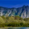
That color is incredible.