
-
Who's Online 15 Members, 1 Anonymous, 59 Guests (See full list)
-
Popular Contributors
-
1

-
2
-
3

-
4
-
5
-
-
Activity Stream
-
693
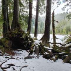
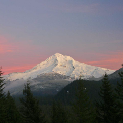
May 2024 Pacific Northwest Weather
Can you point me to the site you pull your data from? -
693
May 2024 Pacific Northwest Weather
so the map is only bad when it shows drier than normal? -
693
May 2024 Pacific Northwest Weather
This is what I don't understand. This chart is almost an exact reflection of the hard rain gauge data in my area. How is my area the only one correct on this map? When you look at the last 2 years, the issue gets compounded. Real life people are feeling these numbers in my area. I'm not a "drought alarmist" these are just facts. I made the reasonable assumption that since these maps accurately reflect the issues in my area that they must be somewhat accurate in others.- 2
-

-
693
-
693
-


Recommended Posts